

The Amazon Got A Logo. And It’s Just The Beginning
How the world's most powerful logos, from Hermès to the FT, stopped labelling brands and started carrying meaning - and what every brand can learn

A new identity for the Amazon region. Three of design’s most thoughtful voices on what logos - from local restaurants to luxury brands and the Financial Times - should do. And the gap between designing a mark and building one that lasts.
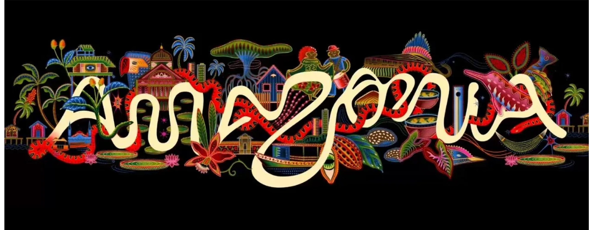
The Amazon region houses over 28 million people, extraordinary biodiversity, and centuries of cultural heritage. And for the first time, it has been given a logo to bring it all together.
Few branding projects this year have had the resonance of this one. The brief was unusual in itself: not a commercial rebrand, but an attempt to give an entire region its first official identity, designed to empower local artisans and unify the territory’s many initiatives under a single, clear symbol.
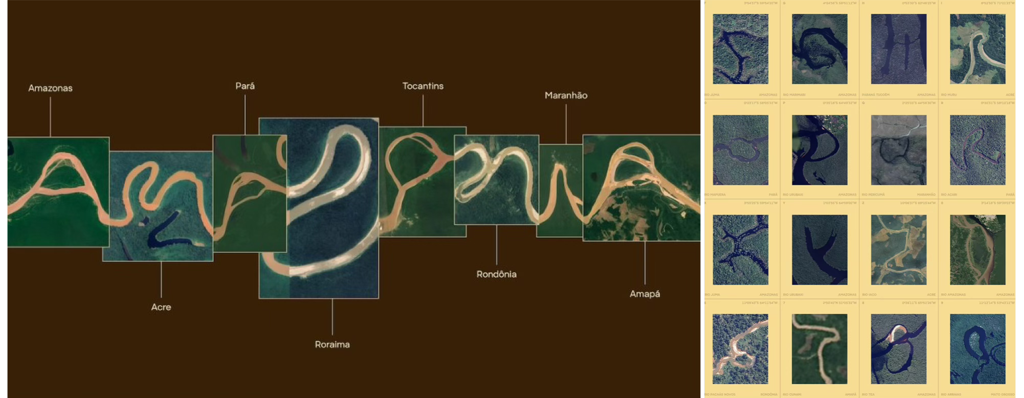
Finding a logo capable of holding that much meaning might have seemed an insurmountable challenge. Which is why FutureBrand São Paulo went back to the source: the place itself. The wordmark is built from satellite imagery of the Amazon river, its curves and meanders shaping the letters of “Amazonia”. Around it sits a wider identity system enriched by collaborations with local artists and stakeholders, designed to surface the region’s rich heritage.
When I asked him about the project, Arnaldo de Andrade Bastos, Partner and Chief Design Officer at FutureBrand São Paulo, said:
“Across the world, many of the most visited and desired tourist destinations have strong, well-established brands. The Amazon has always had this potential, but it had never brought together, in a structured way, all those involved to join efforts toward building it. Now, we present a solid brand that clearly illustrates the richness, diversity and vibrancy of the Amazon, bringing together its main elements and the power of the entire region through a single concept and design.”
What makes the Amazonia logo interesting goes beyond its design. It’s the ambition behind it, the belief that a single mark, properly designed, can do the work of communicating a place externally and uniting it internally. It will need a long-term strategy to live up to that ambition, but it’s a meaningful starting point.
It also raises a strategic question: what exactly are we asking logos to do these days? To find out, I spoke to some of my favourite design and strategy minds about the logos they love, and what they think a logo should actually do. Keep reading to find out.
WHY YOU SHOULD CARE. Logos Are A Beginning, Not An Ending
The way we talk about logos tends to flatten them into either pure aesthetics (”does it look good?”) or pure semantics (”does it tell the story?”). And while logos can do real narrative work on day one, the deeper truth is that meaning isn’t only designed into a mark; it accumulates around it over time.
When Logos Tell A Story
After years of “blanding” - the era when the luxury industry flattened its logos into bold, standardised sans-serifs designed for the digital world - brands are now going back to logos that encode identity, craft, and heritage in a single mark.
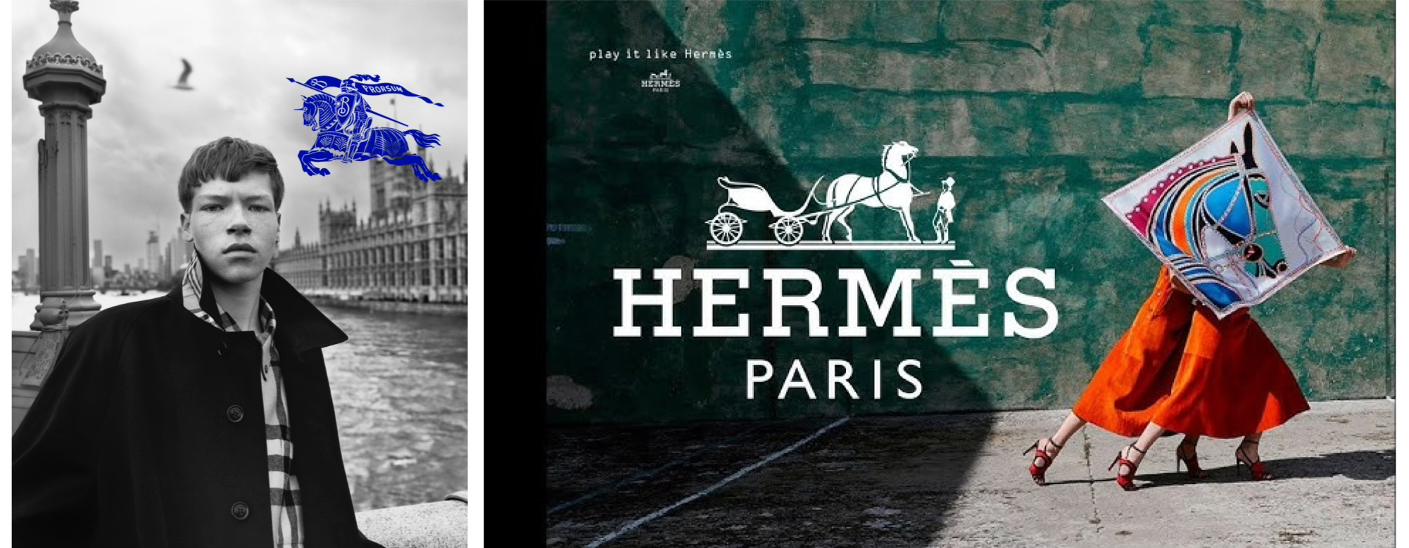
Some of them never abandoned this approach. Hermès started as a saddler in 1837, and its logo still says so: a carriage and a waiting groom, an image lifted directly from the world the brand was built to serve. One simple image carrying centuries of context. Burberry’s Equestrian Knight, restored in 2023, performs a similar function: it visually anchors a long history of British craftsmanship, with the Latin word Prorsum (”forward”) pointing to a forward-looking attitude. Heritage and innovation, held in one image.
These examples represent the case for logo-as-narrative-engine at its most successful. And the principle isn’t reserved for centenarian luxury houses. Jenna O'Brien, founder of Feeling! Magazine, pointed me to a much younger, yet very effective example:
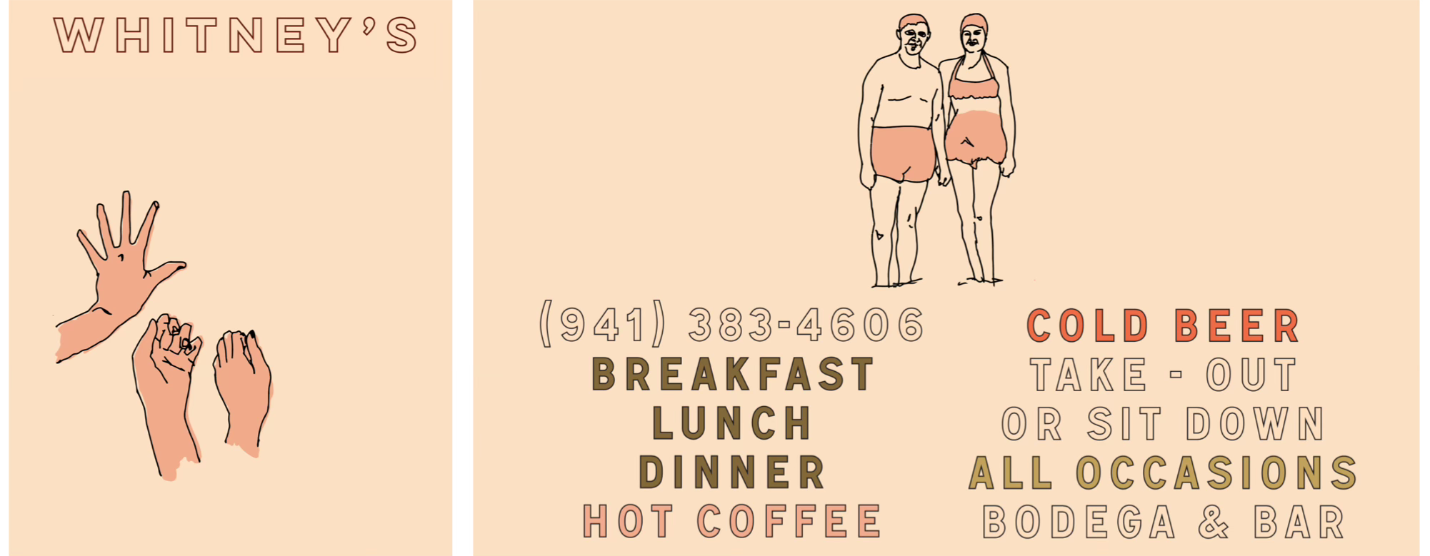
“A beachside restaurant on the West Coast of Florida, called Whitney’s, uses a sketch outline of a couple in swimsuits as one of their primary logo marks. It is mesmerizing paired with tropical old-Florida interiors and vivid (yet somehow sun-faded) colors in every corner of the space. Every aspect of the design points to some rich lore of this restaurant, but it has only been around since 2020. The world-building design, the characters specifically, make you feel like you are a part of a beach legacy.”
No matter how new the brand, a single symbol - whether for a beachside restaurant or an entire region like the Amazon - can do a lot of the communication work when the wider brand language supports it. The logo doesn’t have to do all the work alone, but it sets the entry point: the first signal that tells you what brand world you’re walking into.
Quick commercial break.
Enjoying this?
Paid subscribers to Why You Should Care get the deeper analysis: full case studies on how brands actually build cultural relevance, strategic deep dives, and strategic playbooks worth stealing. The next paid-only piece is out next week.
But The Logo Isn’t The Whole Story
Designing a clear and memorable mark is the starting point, but what happens around it over the following decades is what makes a logo endure. If logos really were narrative engines on their own, every well-designed mark would generate cultural meaning simply by being well-designed. While many beautifully crafted logos remain inert, many visually unremarkable ones carry enormous weight. Something else has to do the work.
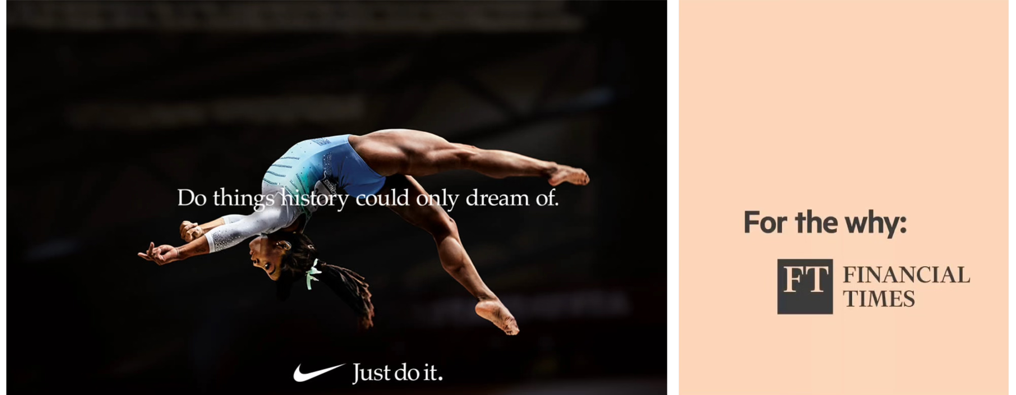
Samuel Moppett, Creative Director at the Financial Times, put it this way:
“The strongest logos go far beyond graphic design. Their power comes from what they come to represent culturally over time: trust, aspiration, memory, belonging. We constantly and subconsciously assign meaning to symbols, typography, packaging and visual language. A wine label can influence taste before the bottle is even opened. Even something as simple as a supermarket orange can be elevated through a premium logo and the language of quality. For me, the FT is a perfect example of this. With just two letters, the FT is able to convey a sense of permanence, clarity and integrity. Unlike many brands, its identity isn’t built on trends or aesthetic heat. The pink paper, typography and masthead have become cultural shorthand for intelligence, credibility and considered taste. I think the power of the FT brand also comes from the robustness of its core identity [...] not just that its meaning extends far beyond the logo itself, but how cohesive and durable it is.
And honestly, I think this is the true luxury of a brand. Not exclusivity or price point, but meaning. A sense of permanence, clarity and cultural trust that compounds over time.”
Like a wine label shapes our perception of what’s in the bottle before the cork is pulled, that gap - between what something is and what we believe it to be - is where logos do their most important work. And that work isn’t only about design; it’s about associations built up around it. The FT mark in isolation is two serif letters. The FT mark after decades of pink paper, journalistic integrity, and cultural credibility is an institution.
Lucinda Bounsall, founder of sibling studio and Post-Culture by Sibling Studio, took the argument one step further, drawing a useful distinction:
“The most powerful logos eventually stop behaving like logos altogether. They become symbols. A label helps you recognise a brand; a symbol helps you feel and remember an entire world. Some of the most powerful examples are marks like the Nike swoosh, Apple’s bitten apple, Chanel’s interlocking Cs. None of these marks are particularly descriptive in themselves. Their power comes from what has been built around them over time.
The swoosh no longer signals sportswear. It signals ambition, discipline, transformation, athletic mythology. Apple’s logo no longer signals computers. It signals creativity and modernity. Chanel’s double C has become shorthand for heritage and cultural status. What makes these symbols powerful isn’t the design alone. It’s repetition, consistency and the accumulation of meaning across products, campaigns, spaces, communities, rituals and cultural moments. Over time, the mark stops pointing to the brand and starts containing the brand. That’s the difference between a logo that labels and a symbol that lasts. The best marks don’t just identify a business. They become a compressed expression of an entire brand world.”
Many logos point you outward, simply directing you to a company. But the ones that become true long-term symbols do something else: they contain. The Nike swoosh is a great symbol because forty years of athletic mythology have been poured into it. The shape now means effort, speed, victory. Without that accumulation, it would just be a tick.
This is what makes the Amazonia project worth watching. FutureBrand’s design has a real strength: it doesn’t need to invent meaning from scratch. The Amazon already carries it, and the new logo design ensures that meaning is carried forward. The mark is grounded in the place, its symbolism, and the heritage richness the region itself already contains. The logo’s foundation is exceptionally strong, and the design honours it.
What happens around the logo now - the campaigns, partnerships, products, cultural moments - will determine the Amazonia logo endures the way Milton Glaser’s I♥NY has, designed in 1977 and still ubiquitous nearly fifty years later.
A logo is the vessel, the brand is what fills it. And neither works alone.
Want to read more about logos and brand strategy? Check out this past piece on why luxury logos are going back to their roots and what this means for brand strategy.
Retrography: Why Luxury Logos Look Old Again

First they flattened their fonts. Then they realised sameness doesn’t sell exclusivity. Now, the world’s most powerful logos are going vintage - and redefining what luxury looks like.